
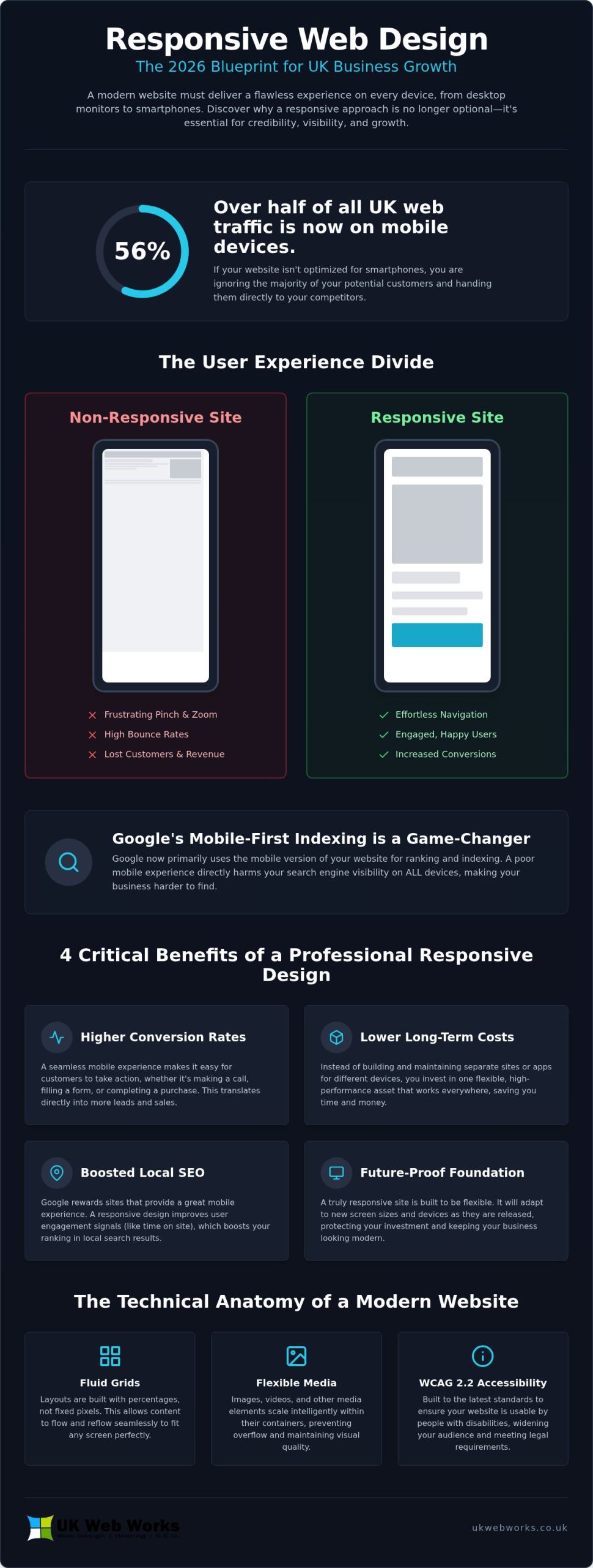
Over 56% of web traffic in the UK now comes from mobile devices, yet many businesses still treat their mobile site as a secondary priority. It’s frustrating to watch potential customers walk away because your website is slow to load or difficult to navigate on a smartphone. You’ve likely felt the headache of trying to decode complex technical jargon from agencies that seem more interested in their own cleverness than your business growth. We believe you deserve a site that works, looks professional, and helps you grow without the unnecessary stress.
In this article, you’ll discover how bespoke responsive web design uk can transform your online presence into a high-performing tool that works perfectly on every screen. We’ll explain why a fluid layout is the baseline for credibility and local search dominance in 2026. You’ll see how a professional responsive web design company can simplify the technical side, ensuring your site meets the latest WCAG 2.2 accessibility standards while building a straightforward, honest relationship with a developer who understands the local market and values your success.
Key Takeaways
- Understand why a website that automatically adapts to any screen size is essential for business credibility and mobile traffic in 2026.
- Discover how bespoke responsive web design uk can boost your local search visibility and prevent potential customers from bouncing to competitors.
- Learn about the technical essentials, such as fluid grids and flexible media, that keep your pages loading fast and looking professional on every device.
- Identify the key qualities to look for in a local Yorkshire agency to ensure you receive a professional, jargon-free service that fits your specific needs.
- Explore why choosing a straight-talking partner with fixed-price fees is the most practical way to grow your online presence without the technical headaches.
What is Responsive Web Design and Why is it Non-Negotiable in 2026?
If you have ever tried to navigate a website on your phone only to find yourself squinting at tiny text or struggling to hit a button, you have experienced the frustration of a non-responsive layout. In simple terms, What is Responsive Web Design refers to a build that automatically ‘responds’ to the user’s screen size. Whether someone views your site on a 27-inch monitor or a compact smartphone, the content reshuffles and scales to provide the best possible experience. Investing in bespoke responsive web design uk means you are building a site that is inherently flexible, ensuring your business looks professional on every device.
We often see businesses stuck with ‘adaptive’ layouts, which are rigid and only change at specific fixed points. These often fail when a new device with a unique screen size hits the market. A truly fluid grid, however, uses percentages rather than fixed pixels to ensure the layout flows like water into a container. It’s the difference between a suit that’s been roughly adjusted and one that’s tailored to move with you. It’s also far more efficient for your bottom line. Instead of paying to maintain a separate mobile site and a desktop version, you invest in one high-quality, flexible asset that does the job of both.
The Death of the “Desktop-Only” Website
User behaviour across Yorkshire has shifted permanently. Whether it’s someone in York looking for a local plumber or a business owner in Leeds researching suppliers, the first interaction usually happens on a mobile device. If your site forces them to ‘pinch and zoom’ just to read your phone number, they will leave within seconds. This poor user experience doesn’t just lose you a single lead; it hands that customer directly to your local competitors who have made browsing easy. A responsive website is the essential foundation of a modern business, not a luxury reserved for large corporations.
Google’s Mobile-First Indexing Explained
Google now uses the mobile version of your website as the primary source for how it understands and ranks your content. If your mobile experience is clunky or slow, your search visibility will drop across the board. This is a critical factor for any SEO agency Hull to address because non-responsive sites are becoming invisible to the 56.4% of UK users who browse on mobile. By choosing bespoke responsive web design uk, you aren’t just helping your customers; you’re telling search engines that your business is reliable, modern, and worthy of a top spot in local results.
4 Critical Benefits of Hiring a Professional Responsive Web Design Company
Investing in a professional build isn’t just about looking modern. It’s about your bottom line. When you work with a specialist team, you get a site designed for human thumbs, not just mouse cursors. This focus on usability translates directly into higher conversion rates. If a potential client in Hull finds your site while waiting for a bus, they should be able to tap a “Call Now” button without needing to zoom in. This ease of use is at the heart of bespoke responsive web design uk, turning casual browsers into paying customers.
A professional build also saves you significant money over the long term. Instead of paying for two separate websites or a clunky mobile app, you have one high-performance asset. This single build covers everything from giant desktop monitors to the latest folding phones and smart displays. For a technical deep-dive into the standards behind this approach, you can read more about What is Responsive Web Design via the Mozilla Developer Network. By building once and building correctly, you ensure your site remains functional as new devices enter the market.
Boosting Your Local Search Visibility
Your digital marketing efforts rely heavily on how users interact with your site once they arrive. If your pages load slowly on 4G or 5G networks, or if the layout is broken on a smartphone, visitors will “bounce” back to the search results. Google tracks this behaviour. A responsive site keeps people engaged longer, which signals to search engines that your content is valuable. This engagement directly supports your local search rankings, making your business more visible to people across Yorkshire who are searching for your services.
Simplifying Your Digital Management
Managing a business is hard enough without worrying about multiple versions of your website. With a single flexible site, you only have one set of content to update and one maintenance schedule to follow. This makes our website maintenance packages incredibly efficient. Security patches and content tweaks are applied once and reflected everywhere instantly. You also get a much clearer picture of your traffic because all your analytics data is collected in one central dashboard rather than being split across different domains. If you’re ready to see how a tailored approach can work for your business, we’re always happy to chat about your project and offer some straight-talking advice.
Beyond Mobile-Friendly: The Technical Anatomy of a Modern Website
Building a website that works on every device isn’t just about shrinking images. It requires a specific technical foundation that starts with fluid grids. In the past, designers used fixed pixel widths. This meant a site looked identical on every screen, often resulting in awkward horizontal scrolling on smaller devices. Today, we use percentage-based layouts. This ensures your bespoke responsive web design uk project flows naturally, filling the available space whether it’s a smartphone or a wide-screen monitor.
The “brain” behind this flexibility is a set of CSS media queries. These small snippets of code detect the user’s screen size and instantly adjust the layout. They tell the browser when to switch from a three-column view on a desktop to a single-column view on a phone. We also use flexible media, ensuring images and videos scale perfectly without slowing down your site. Large, heavy files are the main reason for slow loading times. By serving different image sizes based on the device, we keep your site fast and responsive.
Navigation is another critical technical element. Mouse cursors are precise, but human thumbs are not. We design touch-friendly navigation with buttons that are large enough to tap easily. We ensure there is enough space between links to prevent “fat-finger” errors. This practical approach to design makes your site feel intuitive and professional, regardless of how your customers choose to browse.
The Responsive Build Process
We start every project with wireframing for multiple screen sizes. This helps us decide which content is most important for mobile users versus those on desktops. Testing is equally vital. We don’t just rely on computer simulations; we use a physical device lab to check how your site behaves on real phones and tablets. This rigorous process is essential for any web design Hull project, ensuring your pages load instantly and function perfectly on every network, including 4G and 5G.
Content Hierarchy and Readability
On a small screen, you have limited space to make an impression. We make sure your most important message is “above the fold,” meaning it’s visible without the user having to scroll. We also pay close attention to typography. Fonts that look great on a large monitor can become illegible on a bright smartphone screen. We choose typefaces and contrast ratios that meet WCAG 2.2 Level AA standards for accessibility. A bespoke build provides a level of precision and performance that generic templates simply cannot match, ensuring every pixel serves your specific business goals.
How to Choose the Right Responsive Web Design Agency in Yorkshire
Selecting the right partner for your project is a decision that impacts your business for years. While many agencies operate globally, there is a distinct advantage to choosing a team with local expertise in Hull, York, or Leeds. Being able to meet face-to-face or speak with someone who understands the regional market in East Yorkshire makes the collaboration much smoother. When you are looking for bespoke responsive web design uk, you want a partner who treats your project as a unique piece of craftsmanship, not just another ticket in a system. This local focus ensures your site isn’t just a generic build but a tailored solution for your specific audience.
A simple way to vet an agency is to check their portfolio on your own smartphone. Don’t settle for looking at desktop screenshots on their website. Open their previous projects on your mobile and see how they feel. This is the best way to see the quality of bespoke responsive web design uk in action before you sign a contract. Do the buttons work? Is the text easy to read? If their own clients’ sites are clunky, yours likely will be too. You should also listen to how they speak. If they hide behind technical jargon and buzzwords, it’s often a sign that they aren’t confident in explaining the practical value of their work. We believe in a straight-talking approach where every technical choice is explained in plain English.
Pricing is another area where transparency matters. Many agencies use hourly rates that can spiral out of control. Instead, look for a firm that offers fixed-price project development fees. This gives you certainty from the start, ensuring there are no hidden costs as the build progresses. It allows you to budget effectively and focus on the results rather than watching the clock.
The Value of a Bespoke Approach
Generic, off-the-shelf templates often promise responsiveness, but they frequently fail when you start adding your own content. These templates are built to be everything to everyone, which makes them bloated and slow. A bespoke build is designed specifically for your goals. It ensures your site reflects the work of a dedicated brand identity agency, creating a consistent look that builds trust with your audience. By avoiding the limitations of templates, you get a site that is truly fluid and ready for whatever devices 2026 brings.
Ongoing Support and Maintenance
A website launch is just the beginning. To stay secure and high-performing, your site needs regular updates. Ask potential agencies about their hosting and maintenance plans. Cheap, shared servers often lead to slow loading times and security vulnerabilities. Managed hosting, provided by a local team, ensures your site stays fast and protected. Having a straight-talking partner for the long term means you won’t be left stranded when you need a quick update or technical advice. If you want to discuss your project with a team that values honesty and hard work, you can book a chat with our specialists today.
UK Web Works: Straight-Talking Responsive Web Development in Hull
At UK Web Works, we don’t believe in making things more complicated than they need to be. Our approach to bespoke responsive web design uk is built on a simple foundation: we create websites that work for you, not the other way around. Based in Hull, we’ve spent years helping local businesses across East Yorkshire find their feet online without the technical headaches often associated with digital agencies. We know that you want a site that looks professional, loads fast, and brings in leads. We’re here to deliver exactly that with a refreshingly direct attitude.
Our philosophy is rooted in craftsmanship and honesty. We don’t hide behind buzzwords or high-pressure sales tactics. Instead, we act as a trusted consultant to help you navigate the digital world. Whether you need a simple informational site or a complex build with a specialist ecommerce web design company approach, we focus on the practical impact of every choice. This means ensuring your site meets the latest accessibility standards and works perfectly on the devices your customers actually use.
One of the biggest frustrations we hear from business owners is about spiralling costs and hidden fees. We address this by providing fixed-price project development fees for all our builds. You receive a clear, honest quote before any work begins, so you know exactly what you are paying for. This transparency is a cornerstone of our brand identity. It allows us to build the long-term, collaborative relationships that have sustained our business since 2014.
Why Hull Businesses Trust Our Team
We’ve been part of the local business community for over a decade. This longevity comes from a commitment to integrity and a practical, hands-on work ethic. We don’t position ourselves as a distant corporate entity; we’re a local team that’s always available for a direct conversation. We provide solutions designed to help you reach your specific business objectives, from improved local search rankings to better user engagement. Our specialists are genuinely invested in your success because we understand the regional market and the challenges of growing a presence online.
Ready to Modernise Your Online Presence?
Starting your journey toward a better website shouldn’t feel like a chore. We offer a straightforward, jargon-free consultation to help you understand how bespoke responsive web design uk can benefit your specific business. A professional, fluid site is a vital asset for your local reputation. It ensures that whether a customer finds you on a desktop in York or a smartphone in Leeds, they have a seamless experience. If you’re ready to move away from clunky templates and confusing technical talk, we’re ready to help. Contact UK Web Works today for a fixed-price responsive web design quote and let’s get your project moving.
Future-Proof Your Online Presence Today
A website that adapts seamlessly to every screen size is the baseline for business success in 2026. By investing in bespoke responsive web design uk, you ensure your brand remains visible to the majority of users who browse on mobile while providing a professional experience that builds immediate trust. We’ve seen how fluid grids and technical precision prevent the frustration of slow loading times and clunky navigation, keeping your customers engaged and your search rankings high.
Our Hull-based team is ready to help you navigate these digital requirements with integrity and practical advice. We provide a jargon-free, professional consultation to understand your specific objectives and offer fixed-price project development fees for total budget certainty. It’s time to stop losing potential leads to more flexible competitors and start building a site that works perfectly on every device, every time.
Ready to transform your website into a high-performing business tool? Get a Fixed-Price Quote for Your Responsive Website and let’s discuss how we can help your business grow.
Frequently Asked Questions
What is the difference between a mobile-friendly and a responsive website?
Mobile-friendly sites are often just shrunken versions of a desktop site that are technically functional on a phone but often difficult to use. Responsive design is more advanced; the layout fluidly changes and reshuffles content based on the screen size. This ensures that buttons are always easy to tap and text remains legible without the need for pinching or zooming.
Do I need to build a separate website for mobile users?
No, you don’t need a separate site for mobile users. In fact, maintaining two different versions of your website is inefficient and can hurt your search engine rankings. A single responsive build serves all users from one set of content, which makes your digital management much simpler and more cost-effective over the long term.
How much does it cost to make my existing website responsive?
The cost depends on how your current site was built and the age of its underlying code. In some cases, we can update your existing theme, but for older sites, a complete rebuild is often more economical and provides better performance. We always provide fixed-price quotes after reviewing your current setup so you have total certainty about the investment.
Will a responsive website improve my Google rankings in Hull?
Yes, a responsive site is a key factor for improving your local search visibility. Google uses mobile-first indexing, meaning it primarily looks at the mobile version of your site to determine your rank. If your site provides a great experience on smartphones, you’re much more likely to show up when people in Hull search for your services.
How long does a typical responsive web design project take?
A typical bespoke responsive web design uk project usually takes between four and eight weeks from the initial consultation to launch. This timeline allows for a thorough design phase, development, and rigorous testing across a physical device lab. The exact duration depends on the complexity of your requirements and how quickly you can provide feedback on the designs.
Can I update a responsive website myself through a CMS like WordPress?
Yes, we build most of our responsive sites using content management systems like WordPress or Shopify. This means you can easily update text, swap images, and add new blog posts yourself without needing any technical knowledge. We provide training as part of our service to ensure you’re comfortable and confident managing your new site.
Does responsive design affect the loading speed of my website?
Responsive design actually helps your loading speed when it’s built correctly by specialists. By using flexible images and efficient code, we ensure your site only loads what’s necessary for the user’s specific device. A bespoke responsive web design uk project avoids the “bloat” found in generic templates, which is essential for keeping users engaged on mobile networks.
Is a responsive website better than building a mobile app for my business?
For most businesses in Yorkshire, a responsive website is a much better investment than a native mobile app. Websites are easier for customers to find through search engines and don’t require them to download or update anything. A well-built responsive site provides an intuitive, app-like experience for a fraction of the development and maintenance costs.