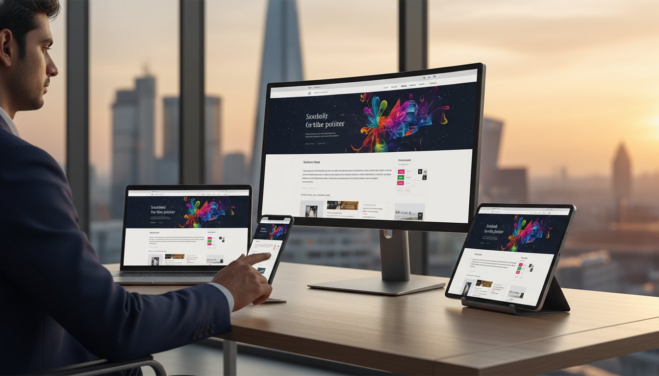
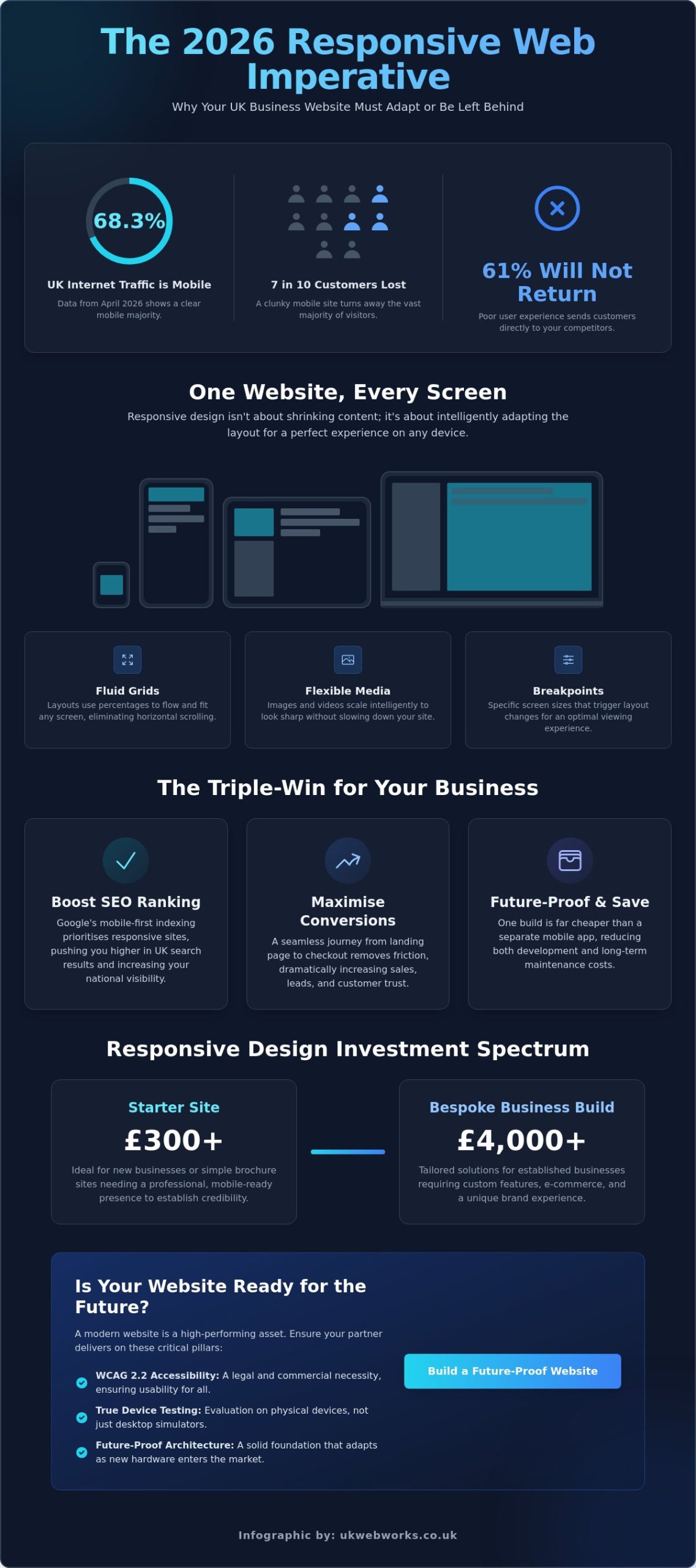
In April 2026, data revealed that 68.32% of all UK internet traffic originated from mobile devices. If your website still feels clunky or “broken” on a smartphone, you’re likely turning away seven out of ten potential customers before they’ve even seen your services. It’s a common frustration for many business owners who feel caught between expensive technical “magic” and the fear of being overcharged. Choosing a reliable responsive web design company shouldn’t feel like a gamble; it’s about finding a partner who understands that your site is your most important employee.
You probably already know that your digital presence needs to be professional, but the jargon surrounding mobile sites can feel unnecessarily confusing. We believe in keeping things simple and transparent. This guide will show you how responsive design works and why it’s the foundation of business credibility in the current market. We’ll also break down the investment value, from starter sites at £300 to tailored business builds reaching £4,000. By the end, you’ll understand how to meet WCAG 2.2 accessibility standards and choose a partner who delivers a site that works perfectly on every single screen.
Key Takeaways
- Learn why adapting your site for every screen size, from smartwatches to ultra-wide monitors, is a legal and commercial necessity in the UK market.
- Demystify technical terms like “fluid grids” and “breakpoints” through a simple, jargon-free explanation of how modern websites actually function.
- Understand the significant cost benefits of choosing a single responsive build over a native mobile app to save on both development and long-term maintenance.
- Use our practical framework to evaluate a responsive web design company by testing their portfolio on physical devices instead of relying on desktop simulators.
- Discover how a bespoke approach to digital craftsmanship ensures your website remains a reliable and high-performing asset for your business.
Why Multi-Device Accessibility is Non-Negotiable for UK Businesses
In 2026, the way your customers browse the web is more varied than ever. It isn’t just about choosing between a phone and a laptop anymore. Responsive Web Design is a specific development approach where a website automatically adjusts its layout, images, and navigation to fit the screen size of the user. It ensures that whether someone is using a smartphone or a desktop, they get a clear and functional experience. This flexibility is the bedrock of modern digital craftsmanship.
The device landscape in 2026 is incredibly diverse. Your customers might be checking your prices on a tiny wrist-based display while commuting, or reviewing your services on a massive 49-inch ultra-wide monitor in their office. Foldable devices have also become mainstream, requiring layouts that can snap between different aspect ratios instantly. A professional responsive web design company ensures that your content doesn’t just shrink; it intelligently reorganizes itself. If your site feels “broken” on any of these platforms, 61% of users are unlikely to return, often heading straight to a competitor with a smoother interface. High bounce rates aren’t just a statistic; they represent lost trust and missed revenue for your business.
The Business Impact of Responsive Design
Google uses mobile-first indexing, which means it primarily looks at the mobile version of your site to decide where you rank in UK search results. If your site isn’t fluid, your national visibility will suffer. Beyond SEO, there’s a direct link between user experience and your bottom line. A seamless journey from landing page to checkout increases conversion rates because it removes the friction that makes people quit. This is why a local responsive web design company focuses on more than just aesthetics; they build for functional reliability. Responsive design is a fluid digital experience that preserves brand integrity across every possible viewport.
Future-Proofing Your Digital Investment
Building one responsive site is significantly more cost-effective than managing separate versions for different devices. It streamlines your marketing and ensures your message is consistent across the board. As new hardware enters the market, a well-built responsive site adapts without needing a total rebuild. However, the web doesn’t stand still. Utilizing website maintenance packages is essential for protecting this investment. These plans ensure that as browsers update and new devices launch, your site’s responsiveness remains intact. Choosing a reliable responsive web design company means your site stays functional as technology moves forward, protecting your brand from becoming obsolete.
The Mechanics of a Responsive Build: From Fluid Grids to Breakpoints
Years ago, websites were built with fixed widths measured in pixels. If a screen was too small, the site simply cut off, forcing users to scroll sideways. Modern mechanics of responsive design have moved away from this rigid structure. Instead of fixed boxes, we use fluid, percentage-based layouts. This shift ensures your content behaves like water; it takes the shape of whatever container you pour it into. For a business owner, this means your message remains legible whether it is being read on a laptop or a handheld device. A professional responsive web design company focuses on this structural integrity to ensure your site never looks accidental.
Fluid Grids and Flexible Images
A fluid grid is the skeleton of your website. It uses relative units like percentages rather than fixed pixels to define the width of columns and margins. This allows the layout to expand or contract smoothly. Images and videos must also be “elastic” to match this fluidity. If a high-resolution image is too large, it can bloat your load times and frustrate users. Conversely, a small image will look grainy on a modern Retina display. We balance these technical needs by optimising media so it stays crisp without slowing down the experience. Navigation is also a key factor here. On a desktop, a user has a precise mouse pointer, but on a phone, they use their thumbs. We ensure all buttons and links are touch-friendly and spaced appropriately to prevent “fat-finger” errors that drive customers away.
Breakpoints: The Secret to Seamless Transitions
Breakpoints are the invisible lines where a website’s layout chooses to change. You can see this in action by resizing your browser window on a desktop. At a certain width, three columns of text might suddenly stack into one. It’s a common mistake to design only for specific iPhone or Samsung models. Because new devices launch every few months, we design for the content itself. We identify the exact points where a design starts to look cramped or difficult to read. This ensures your bespoke website design remains functional at every possible width, from a smartwatch to a massive office monitor. If you want to see how these transitions can improve your own customer journey, you can view our recent projects to see responsiveness in action.
Working with an experienced responsive web design company removes the guesswork from these transitions. We manage the complex coding behind the scenes so you don’t have to worry about how your site appears to different users. Our goal is to provide a reliable, high-performing shopfront that represents your brand perfectly on every screen.
Responsive Web Design vs. Dedicated Mobile Apps: A Practical Comparison
Many business owners wonder if they should invest in a native mobile app rather than a website. While apps have their place for complex tools or games, they create a significant barrier for new customers. An app requires a user to visit a store, enter a password, and wait for a download. In contrast, a website is instant. For most UK brands, Responsive web design (RWD) is the superior choice because it meets the customer exactly where they are without any extra steps. It provides the same professional experience on a phone that they would get on a desktop, all through a simple URL.
The financial difference is also substantial. Building a native app often requires creating two separate versions: one for Apple’s iOS and another for Android. This effectively doubles your development costs and triples your long-term maintenance. You would have to manage three different codebases: your main website, the iPhone app, and the Android app. When you partner with a responsive web design company, you invest in a single, high-quality codebase that works everywhere. This streamlined approach keeps your costs down and ensures your brand message remains consistent across every device.
When a Responsive Website is the Right Choice
A responsive site is the backbone of your digital marketing. It is easily indexed by search engines, meaning new customers can find you through Google. Apps are “closed” systems that don’t contribute to your SEO in the same way. If you want to convert visitors quickly, the “no-download” advantage is vital. Most users won’t download an app just to check a price or book a service. This is why modern ecommerce web design company strategies almost always prioritise responsive builds. They focus on making the buying journey as frictionless as possible for the 96% of the population who use mobile phones to go online.
The Limitations of Mobile Apps for SMEs
For a small or medium business, an app is often an unnecessary hurdle. Convincing a user to give up storage space on their phone is difficult. There are also hidden costs to consider. Every time Apple or Google updates their operating system, your app may need an expensive update to stay functional. A responsive website is far more resilient. It relies on standard web browsers that handle these updates automatically. Choosing a responsive web design company allows you to focus your budget on growing your brand rather than chasing endless technical updates for multiple platforms. It is the smarter, more grounded first step for any UK business looking to build a reliable digital presence.
How to Evaluate a Responsive Web Design Company: A No-Nonsense Framework
Choosing a responsive web design company is a decision that affects your bottom line for years. It’s easy to be dazzled by a glossy presentation on a boardroom screen, but your customers aren’t all sitting in boardrooms. They’re on trains, in coffee shops, and walking down the street using a variety of handsets. To evaluate an agency properly, you must move beyond the desktop. Open their previous projects on your own phone. Scroll, click, and try to fill out a form. If the experience feels frustrating for you, it will be frustrating for your customers. Speed is also a non-negotiable factor. Data from May 2026 shows that 53% of mobile users abandon a site if it takes longer than 3 seconds to load. A site that looks good but moves slowly is a failed investment.
Questions Every Business Owner Should Ask
You need to know how a responsive web design company handles the practical side of design. Don’t be afraid to ask direct questions about their methodology. A reliable partner will welcome the opportunity to explain their craft without hiding behind jargon.
- “How do you handle images for high-resolution screens?” If they don’t mention serving different image sizes to different devices, your site will either look blurry on new phones or load far too slowly.
- “Will I be able to update the content myself without breaking the layout?” A well-built site should use a clean Content Management System (CMS) that allows you to swap text or photos without ruining the responsive grid.
For a deeper dive into vetting your next partner, refer to our website designer selection checklist. It provides a step-by-step guide to hiring a professional who actually delivers results.
Red Flags to Avoid
The digital agency sector is full of vague promises. You can protect your investment by spotting these common warning signs early in the conversation.
- Charging for “Mobile Versions”: If a company tries to sell you a mobile site as an add-on, they’re using outdated technology. Modern web design is responsive by default.
- Template Over-Reliance: Cheap templates often come with massive amounts of unnecessary code. This bloat hurts your SEO and makes the site sluggish for users on slower mobile connections.
- Vague Testing Plans: If they only test using computer simulators, they’re missing real-world issues. Demand an agency that tests on physical hardware to ensure every button and link works perfectly.
We pride ourselves on a transparent, no-nonsense approach to every project we take on. If you want a website that works perfectly on every device without the technical headache, view our bespoke design services to see how we can help your business grow.
Bespoke Responsive Solutions with UK Web Works
We don’t position ourselves as a distant corporate entity. UK Web Works is a team of specialists who value hard work, integrity, and long-term relationships. As a UK business owner, you need a digital partner who understands your local market and the specific challenges of growing a brand online. Our promise is simple: we provide a jargon-free experience that demystifies the digital world. Instead of hiding behind complex technical terms, we explain the “why” and “how” of your project in plain English. This commitment to transparency ensures you always know exactly where your investment is going.
Our Design and Development Process
We don’t start with a generic layout or a bloated template. Our process begins by identifying your specific business objectives. Whether you require a high-performing Shopify store or a bespoke WordPress build, we tailor the architecture to meet your goals. Once the design is ready, we conduct rigorous testing across the full spectrum of modern hardware. This includes everything from the latest smartphones to the massive ultra-wide monitors used in modern offices. We don’t just rely on computer simulators; we test on real devices to ensure every interaction is smooth. Our relationship doesn’t end at launch. We provide ongoing support through managed web hosting and maintenance plans to ensure your site stays responsive as new browsers and devices enter the market.
Ready to Build a Website That Works Everywhere?
Choosing a specialist responsive web design company like UK Web Works is a long-term investment in your brand’s credibility. We believe in fixed-price transparency for our bespoke builds. Whether you’re looking for a starter site between £300 and £1,500 or a more tailored growing business site reaching £4,000, we provide a clear breakdown of costs upfront. If you want a full picture of what professional development costs across the market, our guide to website design prices UK breaks down every tier from brochure sites to complex custom builds. Our national expertise helps businesses across the UK stand out by providing a digital shopfront that is both beautiful and functional. We avoid the high-pressure sales tactics found elsewhere, opting instead for a grounded, helpful conversation about your needs.
Getting started is straightforward. We believe in direct, no-obligation chats to see if we’re the right fit for your project. We’ll discuss your vision, explain our methodology, and provide a clear path forward without any technical headaches. Partnering with an expert responsive web design company ensures your site meets the legal accessibility requirements of the Equality Act 2010 while providing a superior experience for your customers. We invite you to experience a transparent, professional partnership that puts your business success first.
Take Control of Your Digital Future
Your website is often the first point of contact for your customers. Ensuring it works perfectly across every screen isn’t just a technical preference; it’s a fundamental requirement for business growth. By moving away from rigid layouts and embracing fluid, accessible design, you protect your brand’s reputation and meet the legal standards set by the Equality Act 2010. You now have the framework to evaluate a responsive web design company based on transparency, real-world hardware testing, and practical business impact rather than empty jargon.
We believe that professional web development should be accessible and straightforward. Our UK-based team brings over 10 years of digital craftsmanship to every project, ensuring your site remains a reliable asset as technology evolves. We offer fixed-price project fees so you never have to worry about hidden costs or unexpected bills. It’s time to stop settling for a clunky mobile experience and start building a site that truly represents your quality.
Get a Jargon-Free Quote for Your Responsive Website
We look forward to helping you build a digital presence you can be proud of.
Frequently Asked Questions
Is responsive web design the same as mobile-friendly?
No, they aren’t the same. Mobile-friendly means a site works on phones, but responsive design means it adapts fluidly to every screen size. In 2026, with 96% of the population using mobile phones to go online, just being “friendly” isn’t enough. A responsive site ensures that whether someone is on a smartwatch or an ultra-wide monitor, the layout remains perfect. It’s about total accessibility rather than just shrinking a desktop site to fit a smaller screen.
Will a responsive website improve my Google ranking?
Yes, it’s a primary ranking factor for search engines. Google uses mobile-first indexing, which means it evaluates the mobile version of your site to determine your position in UK search results. When a responsive web design company builds your site correctly, it passes essential performance tests. A better user experience leads to lower bounce rates, which signals to Google that your site is a high-quality resource for visitors.
How much does it cost to hire a responsive web design company?
Costs vary depending on the complexity of your project. A small agency starter site typically ranges from £300 to £1,500. Growing businesses can expect to pay between £1,500 and £4,000 for a more tailored, bespoke design. Larger agency projects often start at £3,000 and can exceed £30,000 for London-based specialists. For a comprehensive breakdown of what drives these price differences and how to avoid hidden costs, see our detailed guide to website design prices UK. We provide fixed-price quotes to ensure you have full transparency over your investment without any hidden technical markups or surprises.
Can an existing non-responsive website be converted?
Yes, it’s technically possible, but it’s often more cost-effective to start fresh. Converting an old, rigid site involves rewriting most of the underlying code to make it fluid. A rebuild allows you to implement modern SEO foundations and better user experience standards from the ground up. We often find that a clean start with a responsive web design company provides a much better return on investment than patching up an outdated system.
Do responsive websites load slower because of the extra code?
No, a well-built responsive site shouldn’t be slow. While there is extra code to handle different layouts, modern techniques like image optimisation and lazy loading keep things fast. Speed is vital for your success; data shows that 53% of mobile users leave a page if it takes more than 3 seconds to load. We focus on digital craftsmanship to ensure your site is lean, efficient, and performs well on all network speeds.
What happens if a new device is released after my site is built?
Your site will stay functional because it’s built for content, not specific models. Responsive design uses breakpoints that trigger layout changes based on screen width rather than the name of a handset. This means whether someone uses a new foldable phone or a future smart display, the site adapts automatically. Our maintenance plans also help keep your site’s code updated as browser technology and web standards continue to evolve over time.
Is responsive design necessary for B2B companies?
Yes, it is absolutely essential for B2B brands. Even in professional sectors, over 50% of research and initial contact happens on mobile devices. Business buyers expect a seamless experience when they’re researching suppliers while travelling or between meetings. A site that looks broken on a phone suggests a lack of attention to detail. A responsive site ensures you maintain your credibility and professional image regardless of how your potential partners find you.
Does responsive web design work for ecommerce shops?
It is the industry standard for modern online retail. Whether you use Shopify or WooCommerce, a responsive layout ensures your products look great and are easy to buy on any screen. Mobile conversion rates in sectors like food delivery reached 6.1% in 2025. By making the checkout process frictionless for handheld users, you directly increase your sales. We build bespoke online shops that prioritise a smooth journey from the product page to the final payment.